 ← TO THE BLOG

I’m often asked what’s the best way to judge an agency. My answer is simple, do you like them and, perhaps more importantly, do you like their work?
So without further ado, here’s some of ours. Hope you like?
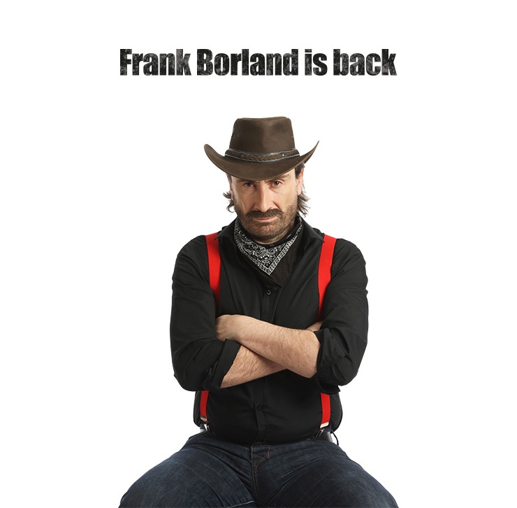
Where’s Frank?
One of our clients is Borland, a software company founded by Danes Niels Jensen, Ole Henriksen, and Mogens Gladrun, but run by Philippe Kahn, chairman and chief executive from 1983 until he left in 1995.
Kahn didn’t fancy being a Steve Jobs or a Richard Branson so created a fictional brand ambassador called Frank Borland, a cartoonish moustached maverick. At first, Frank stuck up for small developers, providing tools usually sold only to enterprise customers. But, according to some of Borland’s fans at least, the company lost its way as it grew, shifting its emphasis towards the big guys at the expense of the lone developers.
Our campaign focused on reviving the Frank Borland character, turning him into a real person played by an actor, with the strapline: “I’m Frank. And I’m back”. It signaled a change in corporate focus. Whereas Ogilvy’s famous ‘Man in a Hathaway shirt’ wore a rakish eye patch, our Frank wore a distinctive handle-bar moustache. He featured across all media – online microsites, email, social media.
The question: “Where’s Frank?” showed that the company was looking to re-connect with its founding principles and rediscover its soul – the brand values that made it popular with lone developers.
We turned the point of friction – the perception that Borland had neglected its core audience – into a story: “The return of the hero”, and signaled to customers that we understood this and were intent on changing it.
See our work here: http://www.trueagency.com/borland-frank-is-back
Smart money,
Another of our clients, Miura Systems, makes clever little boxes that enable mobiles to handle card payments – useful for micro-merchants looking for cheap, secure payment processing.
As a start-up entering a competitive, already-crowded market, the company faced many challenges. It didn’t even have a name yet. We helped choose one inspired by founder, Enrique Garrido’s Spanish heritage. Miura is a type of Spanish fighting bull, and the bull is also the City symbol of financial optimism. So a bull logo usefully told several stories at once.
And we turned our Miura logo into a charging bull to convey energy and power – fitting qualities for a company trying to bash its way into a highly competitive world perhaps.
But rather than advising Miura to crash head-on into market leaders Verifone and Ingenico, as many disruptive start-ups like to do to established competitors, we suggested – counter-intuitively –positioning the brand as a trusted partner rather than direct competitor. After all, no-one had heard of Miura, so blowing a load of cash on traditional awareness-raising seemed profligate and waste of time.
Our “don’t scare the horses” approach meant adopting the same look and feel as existing payment scheme providers in brand designs and website layouts. Our charging bull in effect became a dog trying to insinuate itself into a new pack using unthreatening, conforming behaviour.
You see, not all brand stories need to shout “Look at me, I’m different!” Some can say “I’m one of you and I’m here to help” and prove equally as effective.
Miura has the majority of the market now, including PayPal, iZettle and Payleven.

See our work here: http://www.trueagency.com/miura-colour-of-money