
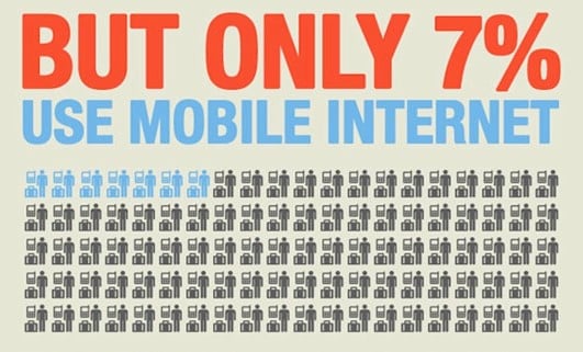
Congratulations for reading past that compelling statistic above. Now here’s a take on the traditional pie chart.
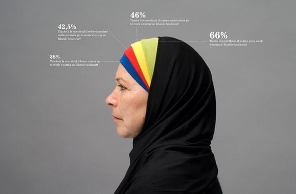 Every picture tells a story but sometimes it takes a clever combination of words and pictures to tell a story quickly, concisely and in an engaging fashion.
 We trawled the web to uncover the very best examples of B2B infographics, to show you just how it should be done. But sadly, there was a real lack of great examples for B2B.
Humans have short attention spans and, let's face it, the internet is cluttered. To stand out, boost engagement, and increase shareability, many B2B marketers should turn to visual content but to really cut through we need to create visual stories.
To do this effectively they should do the following:
- Tell a story with a beginning, middle and end
- Explain complex or quantitative information better than regular copy would
- Be easy to share and embed
- Help with SEO. Use ALT Text to describe your infographic. Also, surround it with SEO-enriched text, such as a blog post. Then share the blog post, not just the graphic
- Connect it to your content strategy, value proposition and your customer’s needs and pains
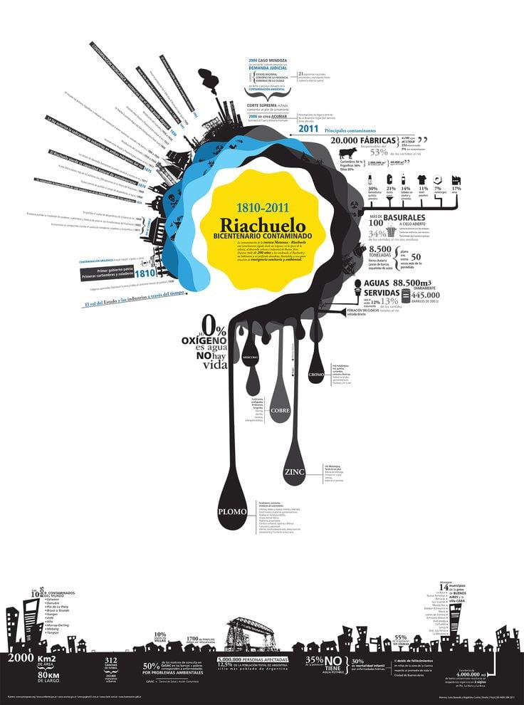
So here are some consumer targeted infographics that set a bar that we as B2B marketers should be aspiring to.
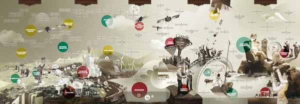
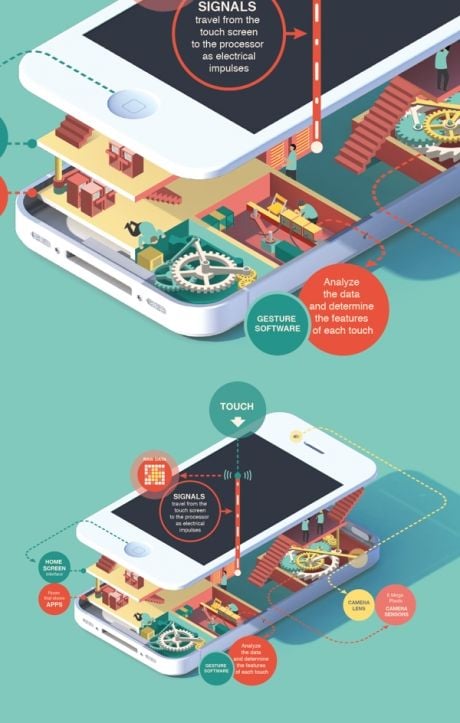
Finally, here is a stunning example of a parallex infographic from Sony:
It really was disappointing that is was so difficult to find great examples of B2B infographic best practice. Here's a recent one of ours for Visual COBOL. Have you any you can share?